Using color themes to establish a visual style
Published on
When using visual ambience, color can be a surprisingly simple and effective way of creating a mood and establishing a consistent visual style for a location, a session, or even an entire campaign. Color has long been used by painters, cinematographers, and many other visual artists for exactly this purpose. Even without the time and expertise available to professionals in the field, you can use simple versions of this technique to make a noticeable impact on your game.
The impact of color
At its simplest, color can be used to associate a scene with a concept, or emphasize a concept that is already present. To name but two examples, blue can be used to signal that something is cold and artificial while green is commonly associated with either nature or toxicity. A distinct and well-known example of applying this technique to an entire film is Traffic, where scenes taking place in the US are colored blue, while scenes taking place in Mexico are colored yellow.
Whatever color you choose to associate with a given concept, the end result is that your plot and ambience will strengthen each other. When the characters are dealing with a concept, the color in your ambience will intensify the experience. Likewise, when you show an image, the players will anticipate events involving concepts that you have associated with that image’s color theme. This is similar to how emotional music can both create emotion where it’s needed and strengthen emotion that’s already present.
How to create a color theme
If you’re lucky, you have already found a collection of images from a single source that all share the same color theme. In most cases, however, your images will come from different places and won’t necessarily share a common theme. In these situations, you can use image manipulation software to enforce a color theme of your own.
While the details and capabilities of specific software are beyond the scope of this post, a few general concepts are applicable essentially everywhere and can be used even without special training. Generally speaking, you will want to focus on options that allow you alter the hue, saturation, brightness/lightness, and contrast of an image. By tweaking these factors, you can decide how the color theme should look and how prominent it should be in a given image.
An example color theme
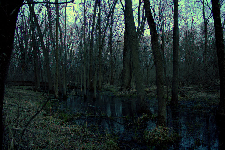
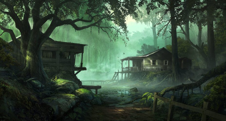
For a recent game inspired by material like The Reaping and the Swamp Fever scenario in Left 4 Dead 2, I had collected a fair amount of swamp-related artwork, but I didn’t feel that its tone matched what I wanted to convey. Overall, the images felt either too cold or too bright. Below is some of the original, unedited artwork that I wanted to use:
I decided that I wanted to present a consistently warm and vivid feeling, but at the same time somewhat dim and sickly, even unnatural. In my mind, the type of swamp that I wanted to create was clearly yellow, so that’s the color that I choose. After a few filters and color adjustments, here’s what I came up with:
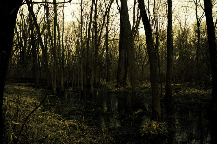
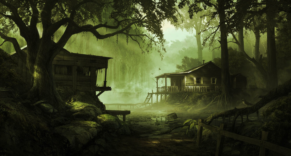
The first effect is that the coldness and brightness that I disliked has been reduced. The second is that the images now have much more consistent color palettes, making scene transitions less jarring and clearly conveying that the characters are still in the same general area.
If you have comments on this post, send them in and they might be featured on the blog.